Refreshing a beloved brand
Logo Design
Branding Identity
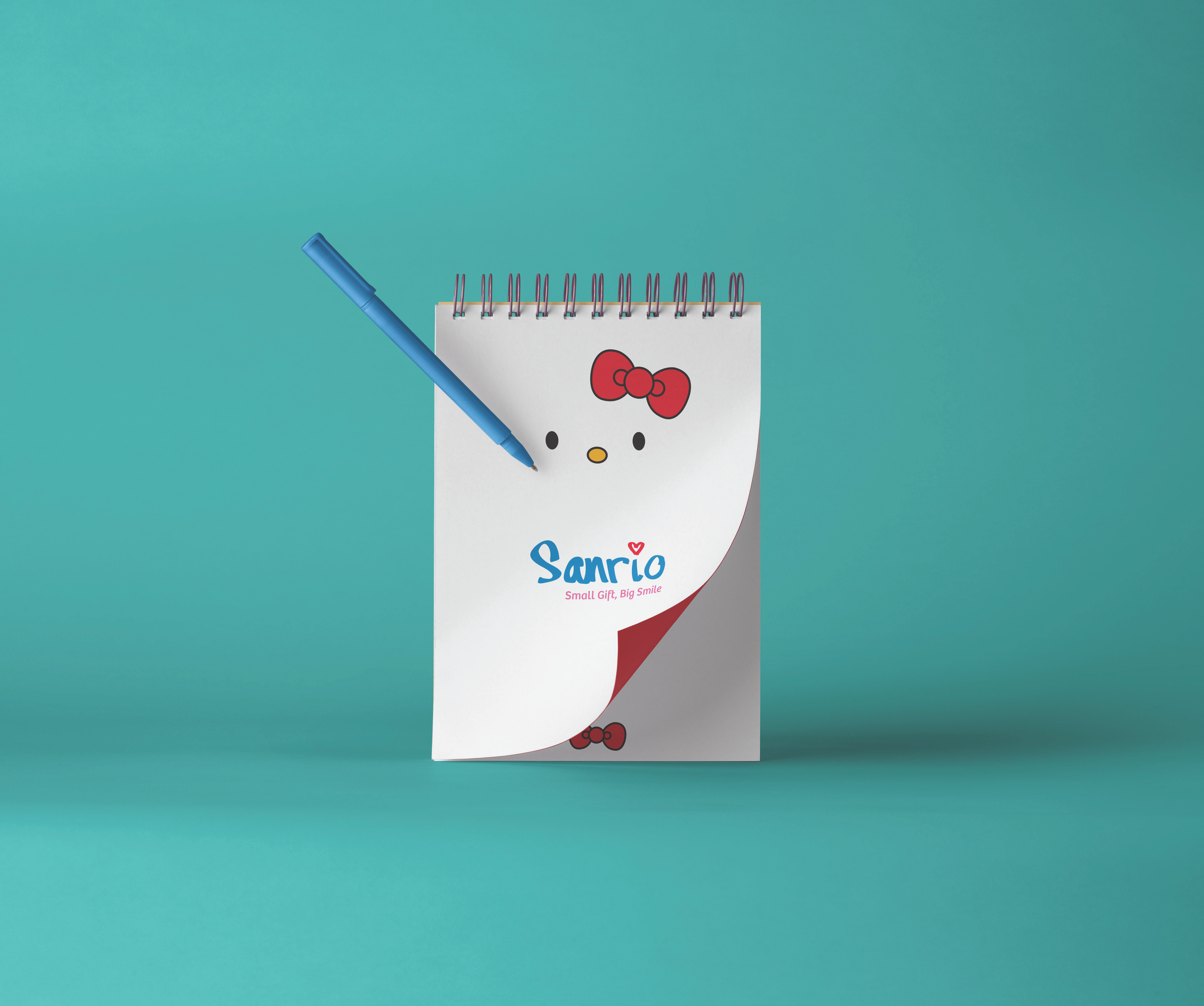
This rebranding for Sanrio updates a legacy brand by creating a more modern logo for our time while keeping nostalgic notions of childhood happiness. The study involves looking at the readability of the logo and deciding how to clear up any possible confusion. One goal was to give the logo a handwritten touch, as I later found the typefaces I chose were not speaking to that innocence I usually associated with this company. After writing the name repeatedly on numerous sheets of paper in Sharpie, I puzzled together letters I liked and further developed the logo until I found the one that felt right. The new and improved design can bring this joyous and happy company into the 21st century.